Few companies have experienced growth at the same scale as Canva.
In less than 7 years, they have acquired over 15 MILLION users, 300,000 paying customers, and have been valued at 3.2 billion dollars (USD) after recently closing a $125m (USD) funding round.
In the first 2 years alone, they reached 2 million users — averaging 3,600 signups a day, or 111,111 signups per month.
So, what sent Canva into hypergrowth?
Undoubtedly, their product and business model played a huge role. There was nothing like it at the time.
But like any product, they had to make sure people heard about them and knew what they did.
That’s where marketing comes in.
It started back in 2012, when one of the co-founders – Melanie Perkins – was teaching students how to use programs like InDesign and Photoshop — software that people found hard to learn and even harder to use.
At the time, the only tools on the market for graphic design were far too ‘overpowered’ and complex for most people to use.
There had to be a better way for the average person to create beautiful designs. After realising that this was a potential starving market, Melanie set out to create Fusion Books, which later evolved into a separate product: Canva.
In this growth study, we’ll dig into how Canva acquires users by analysing:
- What they do to acquire traffic
- How they turn that traffic into users
Behind the strategy
Their vision happens to align perfectly with the needs of that starving crowd.
It’s based on the idea that your customers are trying to accomplish something with your product — that’s the “Job” that needs to be done.
These jobs could be something like:
I want to design graphics quickly and easily.
Or we can dive deeper:
I want to create a Facebook ad without the frustration of using Photoshop.
These are, in essence, more specific variations of their company vision. As we analyse and dissect Canva’s growth strategy, you’ll notice that almost everything Canva does aligns to the needs of the starving crowd by showing them how they can achieve the job that they’re trying to accomplish — being able to design anything, quickly.
Content marketing
There’s no doubt in my mind that content drives a lot of user growth and retention for Canva. It’s the 3rd pillar of their SEO strategy, but deserves its own section.
Their content strategy is well planned out and executed — even after 100’s of blog posts, tutorials, and videos, Canva has rarely strayed from the path of helping people succeed with design.
What’s important to point out, is they don’t have much, if any, consideration-stage or gated-content on their website. This is common amongst product-led companies, as it’s often more effective to generate leads by pushing them straight to a free plan or a trial.
When looking at their content efforts, we can chalk their success down to 3 areas:
- Blog structure
- Article structure
- Design school
Article structure
From their content topics, it’s clear that the content team is focused on results. That means paid signups. And to a lesser extent; trial signups and free signups.
This results-first attitude becomes even more prevalent when we read their articles — every page has 2 consistent elements:
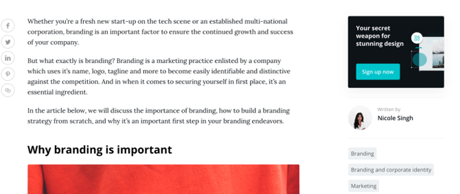
- A sidebar Call To Action

- And a call to action in the footer

Both of these are common elements on a blog that’s optimised for conversions. But what makes Canva stand out is their relentless use of advertorials.
An advertorial is a sales-oriented informational piece. It’s often an article which heavily promotes a product with the intention of turning readers into customers.
